![]()
Not only can you hover over each of the methods and see examples, but the chart itself helps us to see connections between different approaches. The table itself is an example of how the right visual can not only present information but actually make knowledge by organizing material.
See the link below for a useful mapping tools overview:
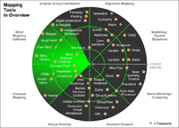
Visualization Software: Mapping Tools in Overview
Here is a page on which you can see and print the mouseover pictures individually. More information
Here you can group the visualization methods by your criteria and you can find background information for a specific visualization method via 'Google Images' and 'Wikipedia'.
Comments (0)
You don't have permission to comment on this page.